2 / 16
Do Corp
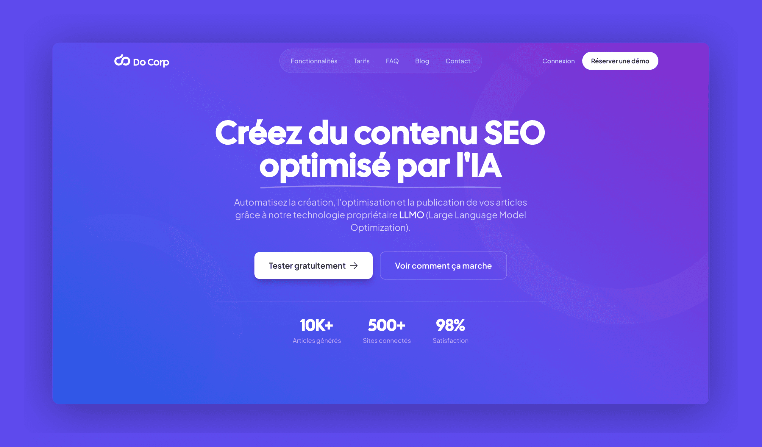
Do Corp was born at SP Formation to automate search optimisation with AI, including for conversational engines (LLMO). For a year, I was part of the three-person technical team that built the engine. Two and a half months before the launch, set for 1 January 2026, the verdict was clear: the technology worked, but the interface had neither identity nor usability. I was given art direction and UX/UI, with a junior graphic design apprentice to supervise. It became the subject of my Master's thesis.
How do you design an identity and a design system for an automated platform that reconcile strict accessibility with an innovative, reassuring look, for very different users?
Finding the open space
I mapped the market on two axes: classic SEO or LLMO, expert tool or accessible tool. Experts are held by Semrush and Ahrefs, accessibility by Yoast and RankMath, innovation by interface-less APIs. One square was left empty: accessible innovation. Do Corp settles there, with a simple promise: make SEO AI understandable for everyone, without holding pros back.
Two users with nothing in common
Marie, 34, runs an online shop: she wants jargon-free, guided, reassuring SEO. Thomas, 29, is an agency SEO lead: he wants shortcuts, exports and an interface that responds in under 100 ms. The rule: the default visible layer serves Marie; everything Thomas needs is still there, but unfolds on demand (progressive disclosure).
A measured benchmark, not a gut feeling
Ten interfaces analysed (shapes, colours, typography, style), with their accessibility measured in Lighthouse. Rejected: Semrush's density (78/100), Gov.uk's brutalism (100/100 but austere), Figma's multicolour. Kept: Stripe's fine rules and soft shadows (98/100), Claude's warmth, RankMath's blue-violet gradient (88/100).

Curves to reassure
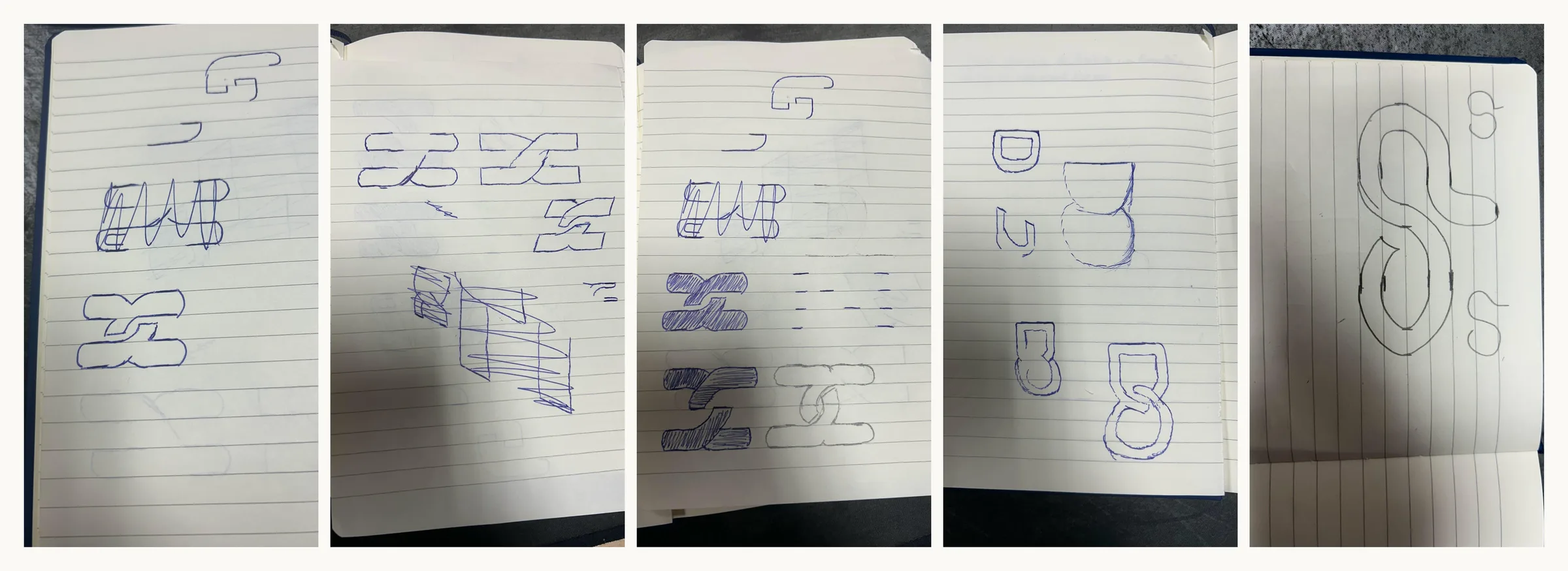
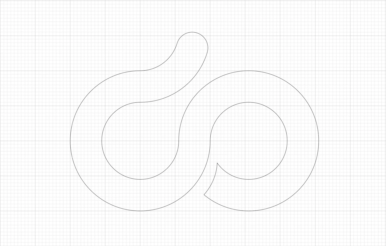
Sharp angles suggest rigidity, curves reassure (Lidwell's “contour bias”). So the “do” monogram is made of perfect circles and a single continuous stroke. First lettering: “DO CORP” in all caps. Too authoritative for Marie. Final version: “Do Corp” in Cal Sans, more conversational.


- text on background (AAA)
- 16,4:1
- action blue (AA)
- 5,6:1
- accessibility (Lighthouse)
- 94/100
- minimum touch target
- 44 px
Accessibility as the starting rule
WCAG 2.1 AA and RGAA 4.1 weren't a final check: they drove the choices. The very light blue-grey I liked for secondary text topped out at 3:1, so it went. Without subtle shades, hierarchy comes from white space, typographic scale contrasts and component shapes. That constraint is what produced the brand's minimalism.
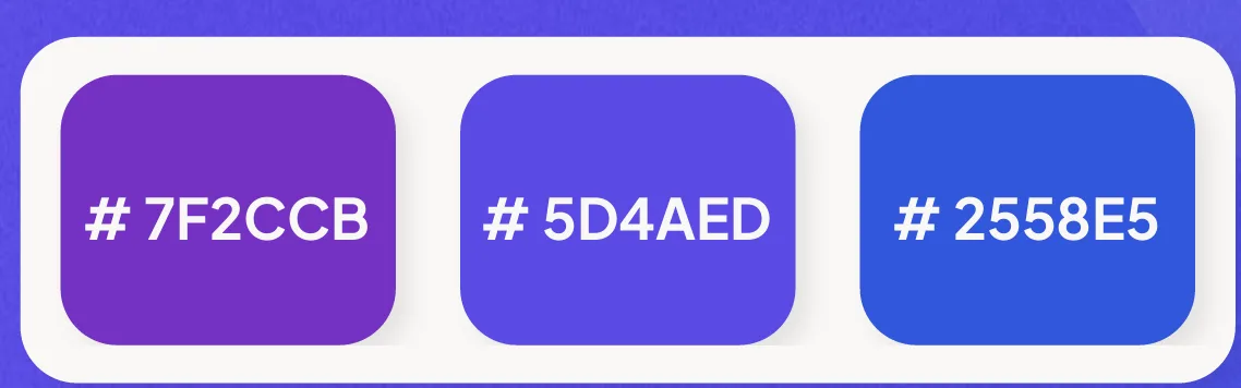
Colours: action blue #2558E5 for everything clickable, innovation violet #7F2CCB for AI, and a 35° gradient with an indigo #5D4AED stop at 50% to avoid a dull grey in the middle. Off-white background, dark grey text rather than black.
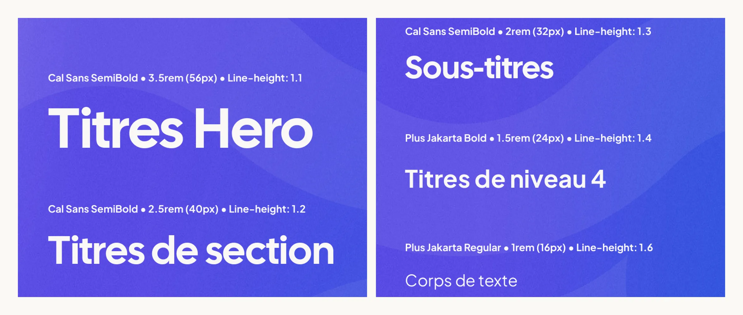
Direct-to-Code
No high-fidelity mock-ups: the guidelines were written as design tokens (8 px grid, type scale, gradient colours), then built straight into React. The risk: less material to get the direction approved. The gain: accessibility checked in a real browser, at every step, with Lighthouse. On the team side, written briefs, moodboards and staged reviews to pass the direction on to a first-year apprentice.
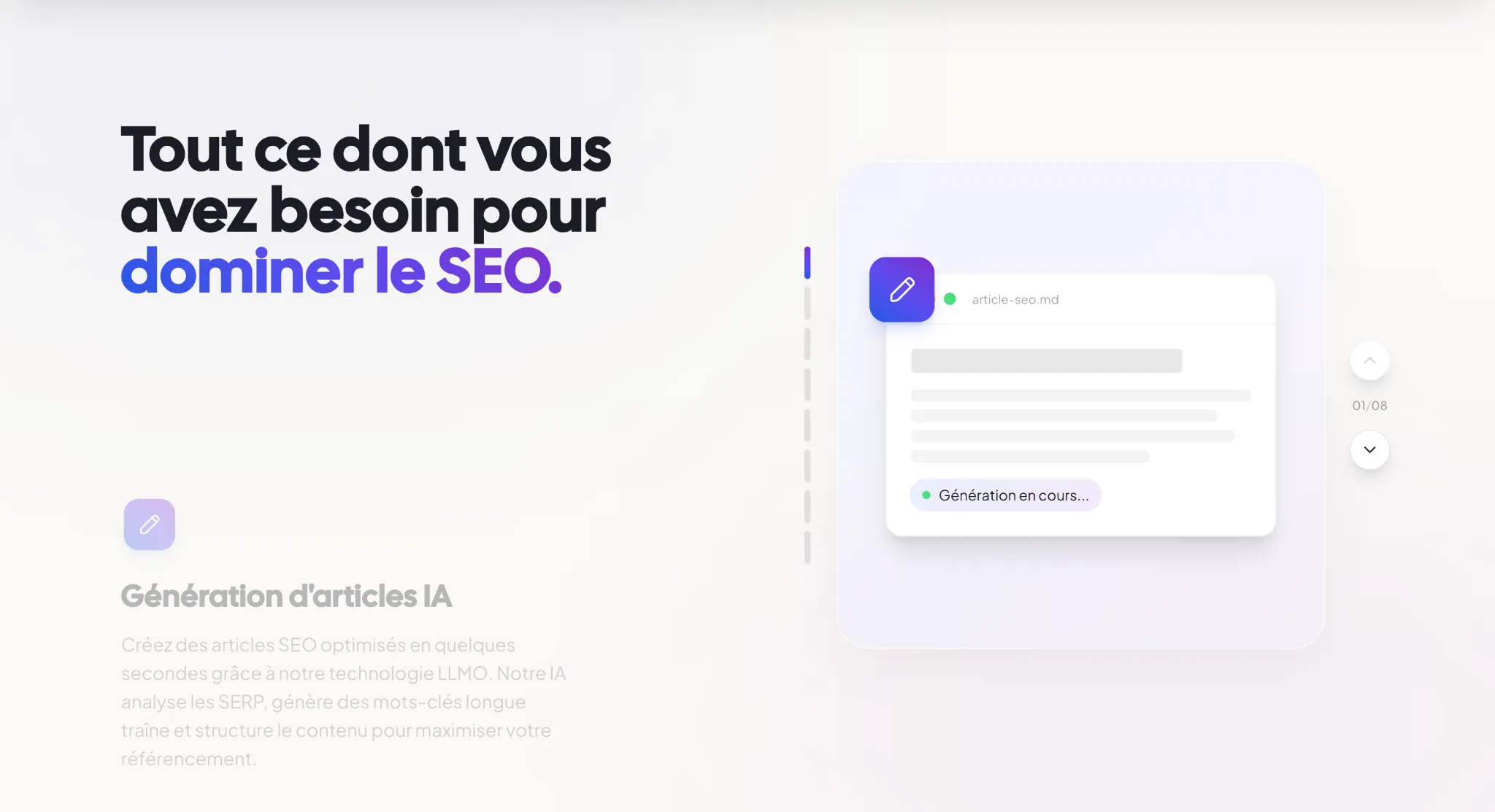
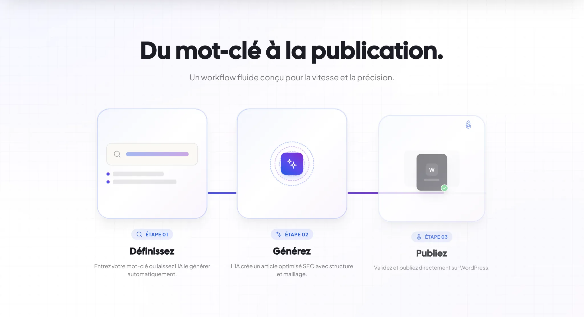
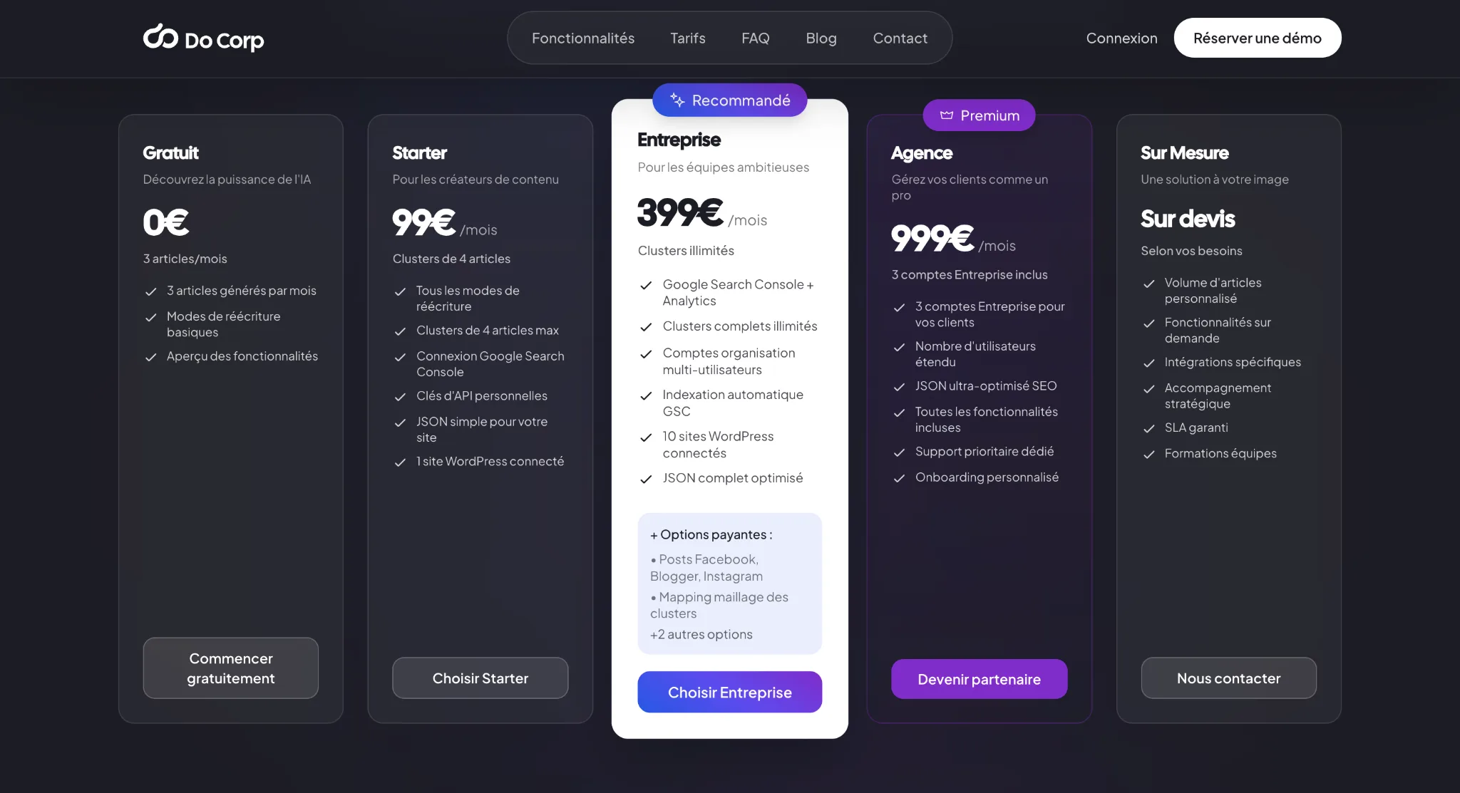

On social media and in video
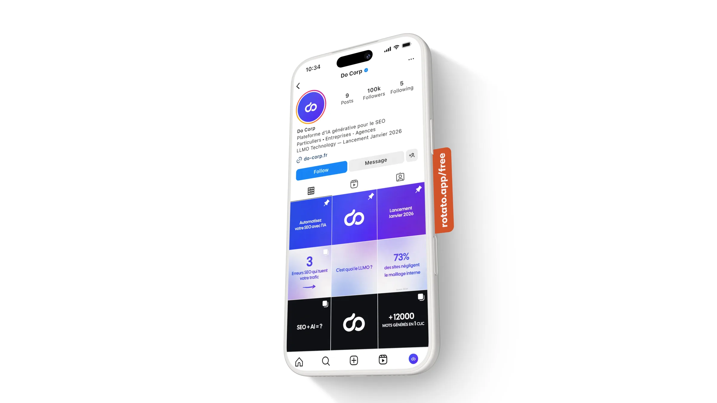
The guidelines extend to Instagram and LinkedIn, and to a motion design ad made in After Effects: “Do Corp speaks LLMO”, from topic to article, all the way to “seen by AI, found on Google”.

What I took away
Accessibility and visual innovation aren't opposites, as long as one structures the other from the start. And moving from code to design, I learned that technology, however powerful, is worth nothing if nobody understands its interface.
Tools
Illustrator · Figma · After Effects · React · Vite · TypeScript · Tailwind CSS · Framer Motion · Lighthouse · Notion
Links
Documents
Credits
- Role
- Art direction, UX/UI & front-end development
- Timeline
- Two and a half months (late 2025)
- Client
- Do Corp