10 / 16
Paris 2024 Paralympic Games
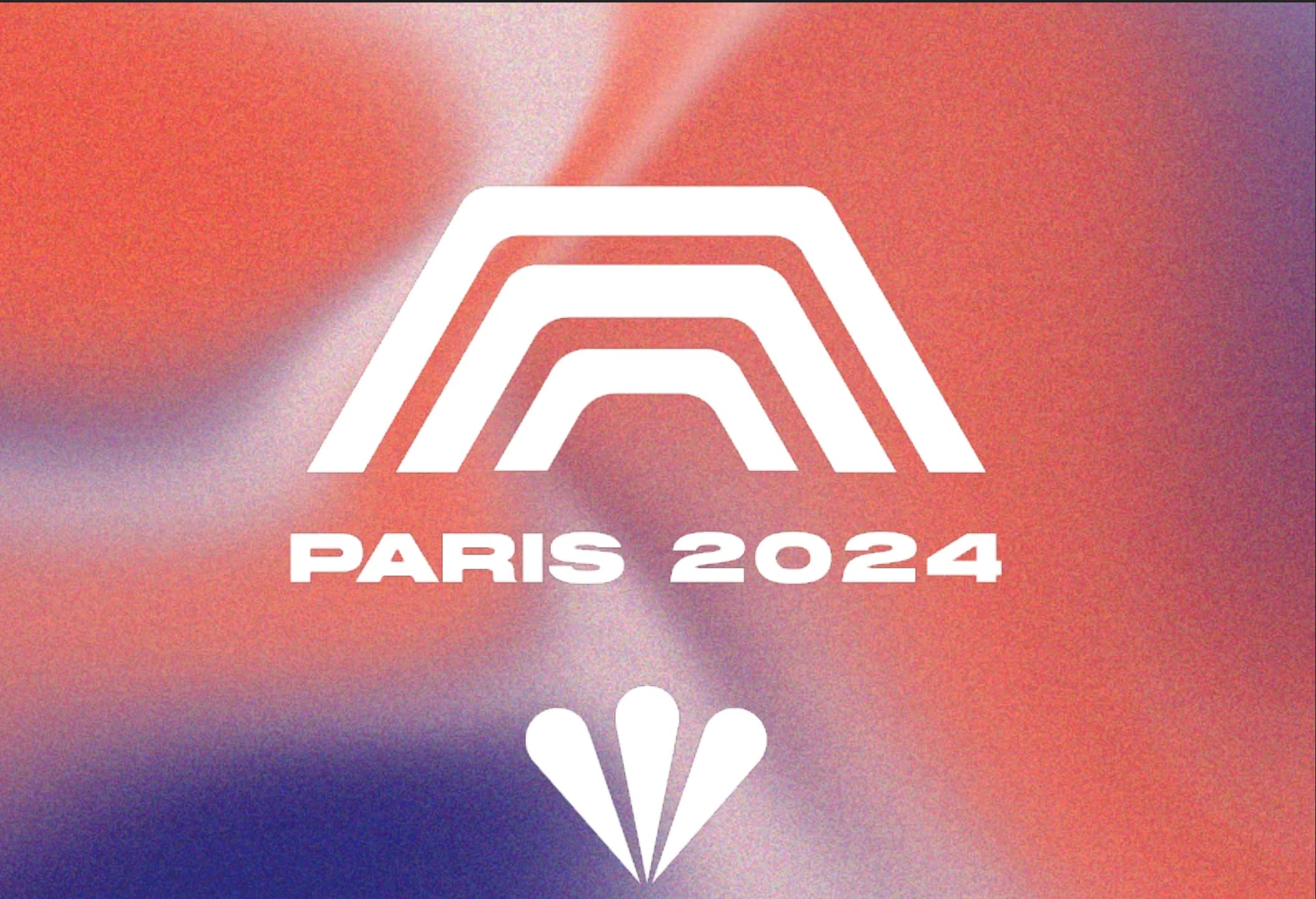
A school project made in pairs with Alice Da Costa: rethinking the identity of the Paris 2024 Paralympic Games, starting from the city's symbols, with a modern and accessible approach. Three values had to come through everywhere: inclusivity, pushing your limits, and solidarity. Alice led the technical side of the art direction: she produced the logo, the colours and the applications. I carried the art direction vision, worked through the thinking with her at every step, and designed the mockups.
- pictograms
- 23
- colours
- 6
- typefaces
- 2
- pages of guidelines
- 30
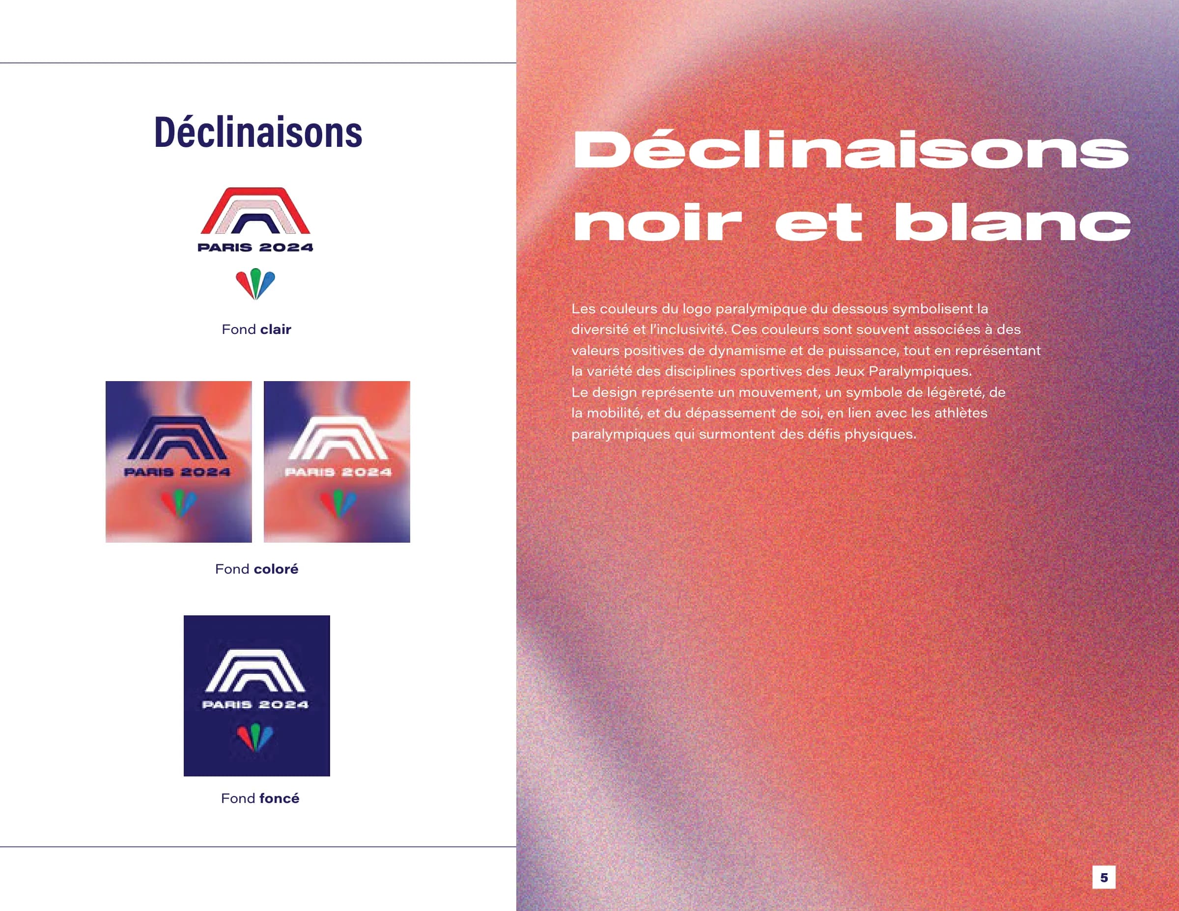
A logo made of Paris
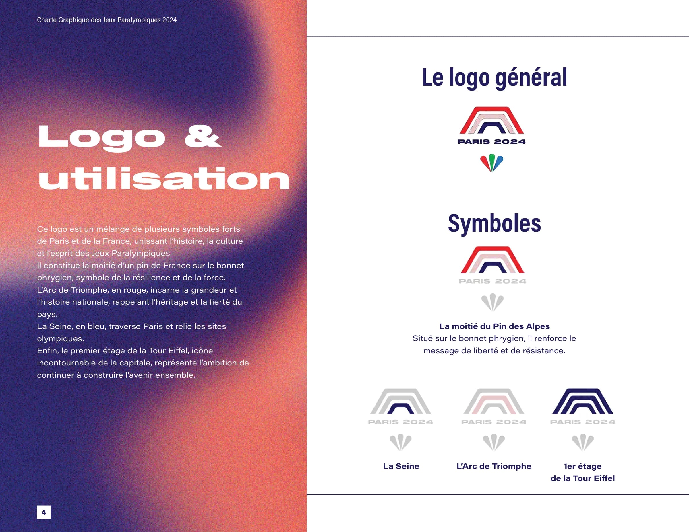
The symbol layers several strong signs of Paris and France. The Arc de Triomphe, in red, for the country's history and pride; the Seine, in blue, crossing the city and linking the Games venues; the first floor of the Eiffel Tower, for the drive to keep building together. It all sits on half of an Alpine pine, placed on the Phrygian cap: a message of freedom and resistance.
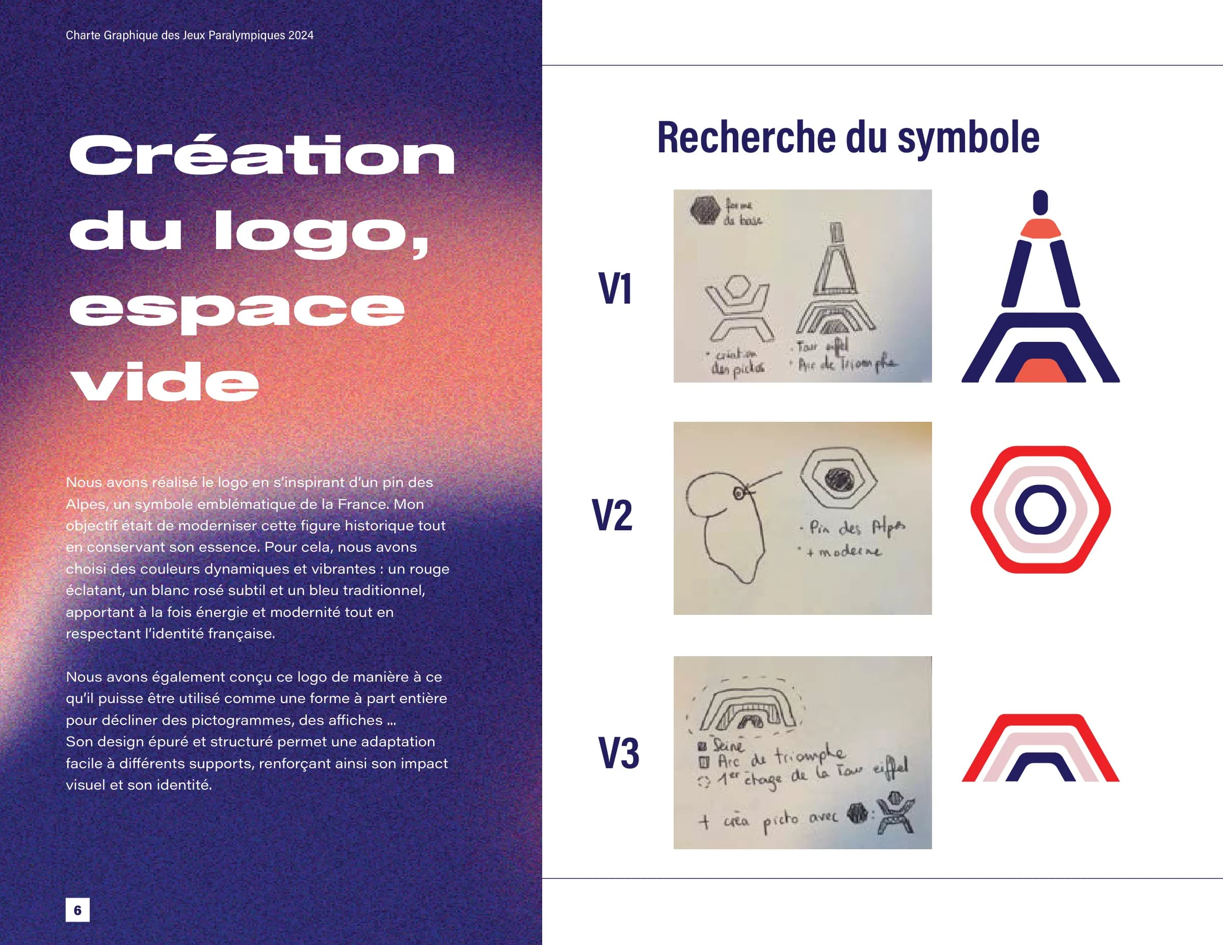
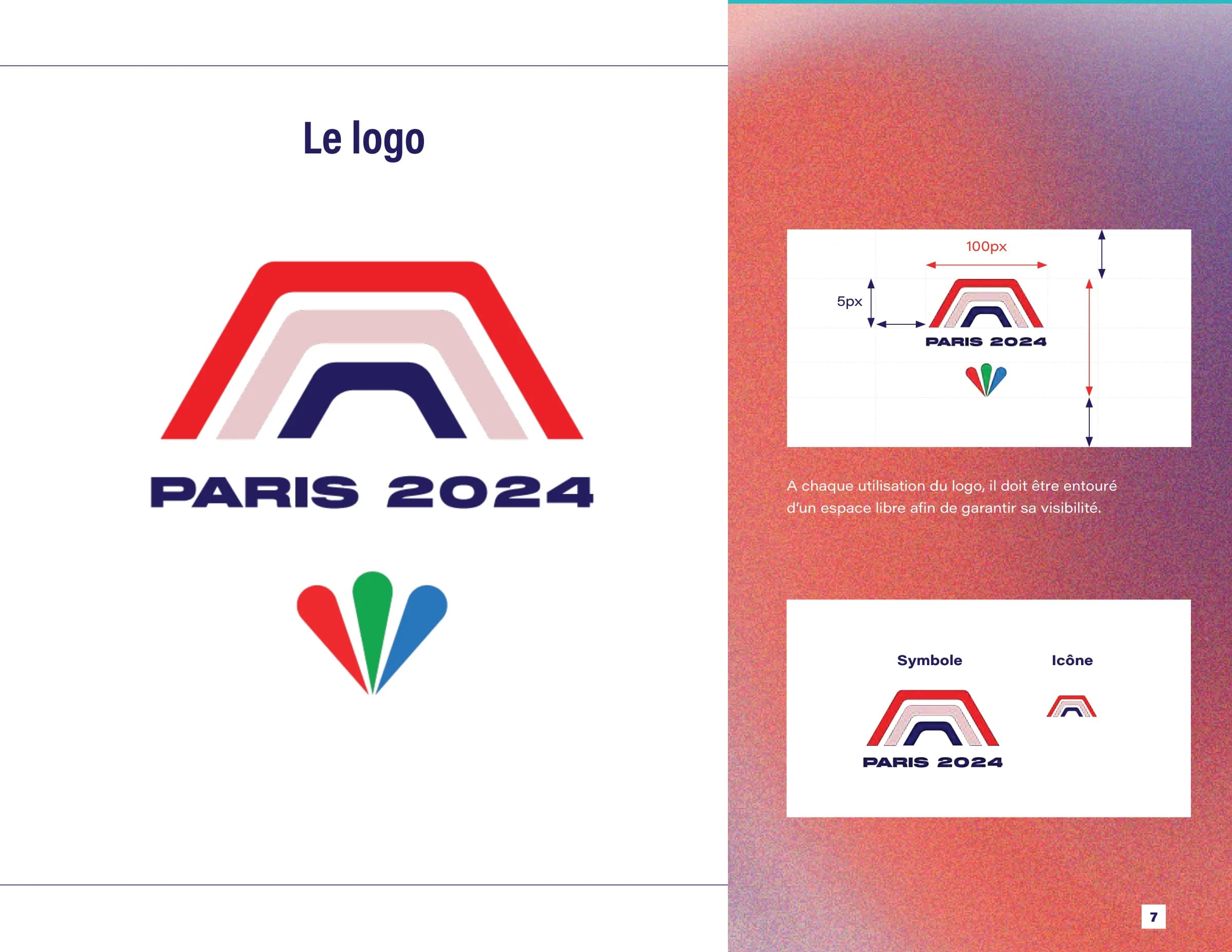
Below the symbol, the three coloured petals of the Paralympic mark express the diversity of athletes and disciplines, and movement: lightness, mobility, going beyond. The logo was designed as a shape in its own right, able to give rise to the pictograms and posters. Three directions were explored before the final version.
Two typefaces, one palette
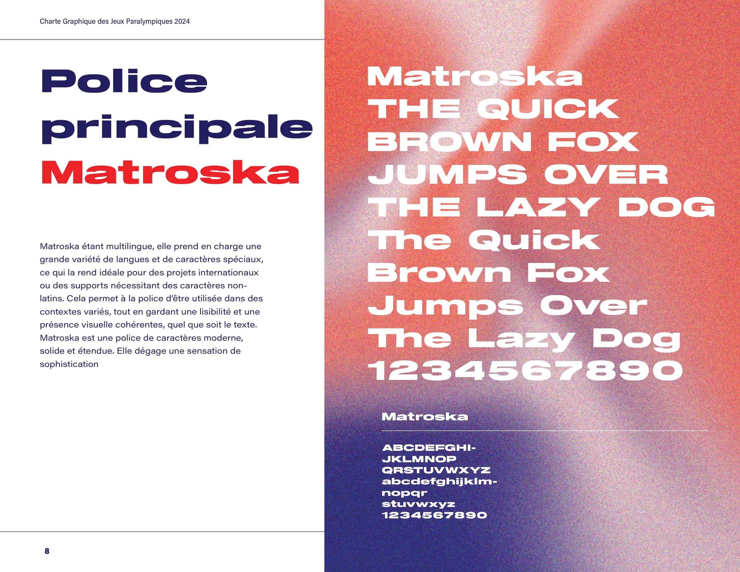
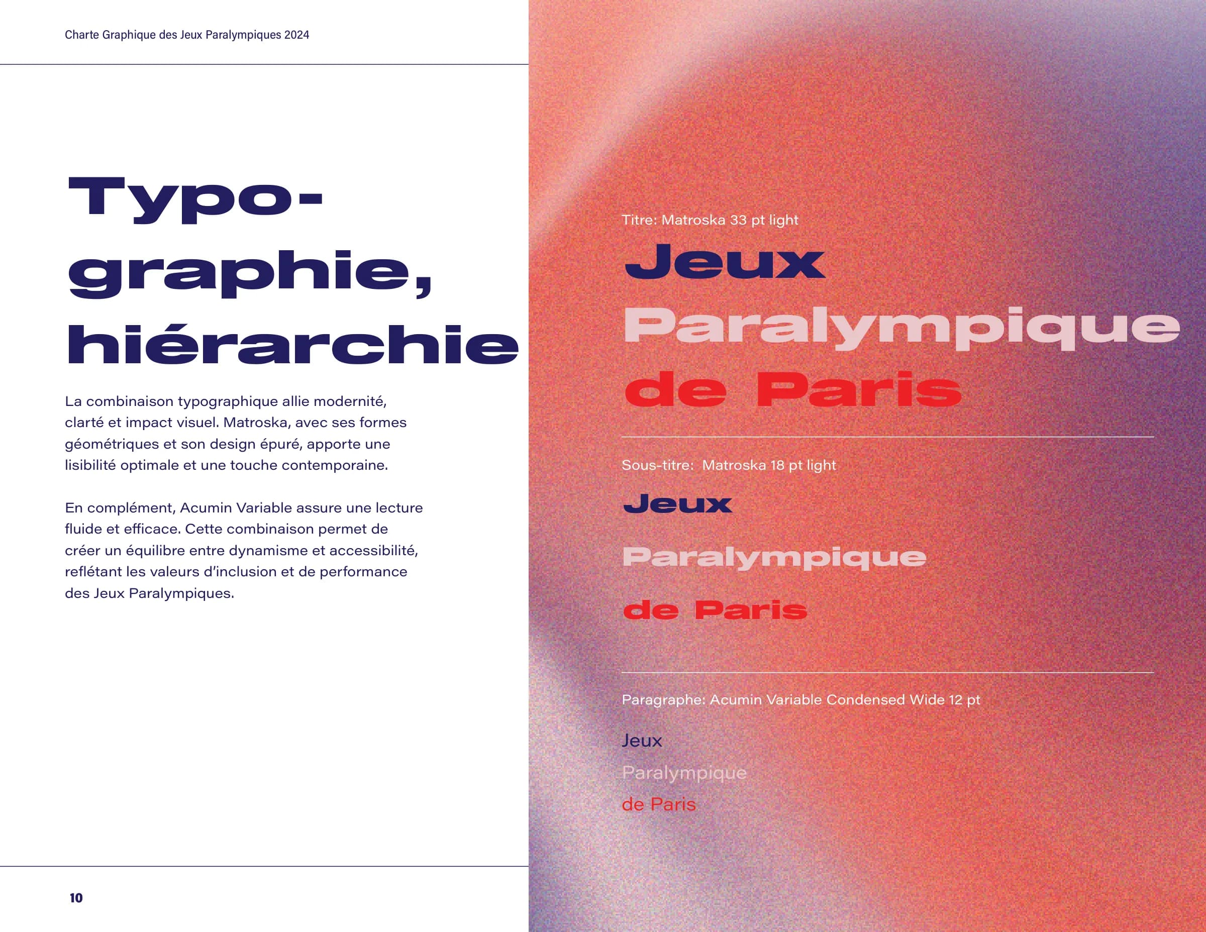
Matroska for headings: an extended, solid, multilingual typeface that gives big words presence. Acumin for text, in its Wide, Regular and Condensed Bold styles: crisp and highly legible, for smooth reading. The pair balances impact and accessibility.
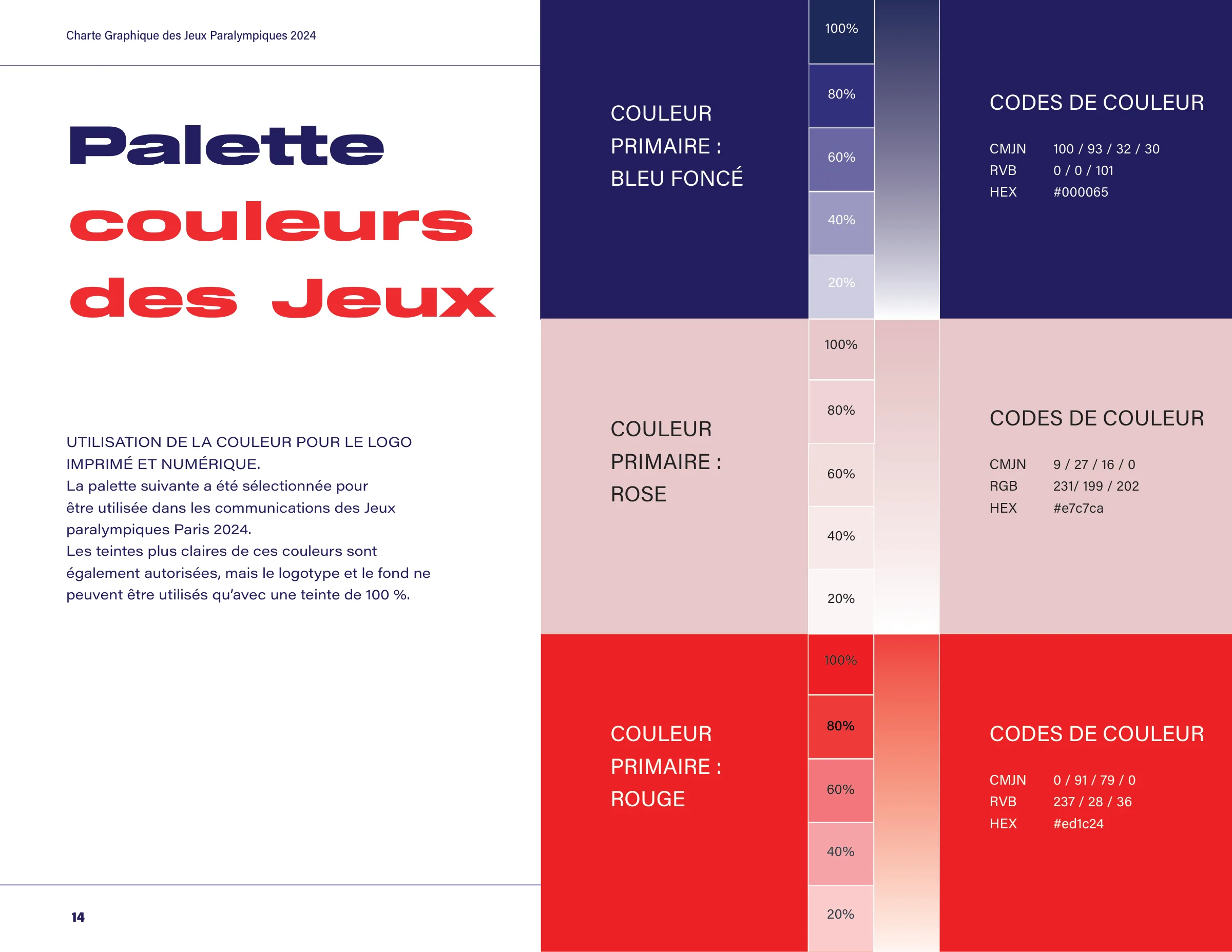
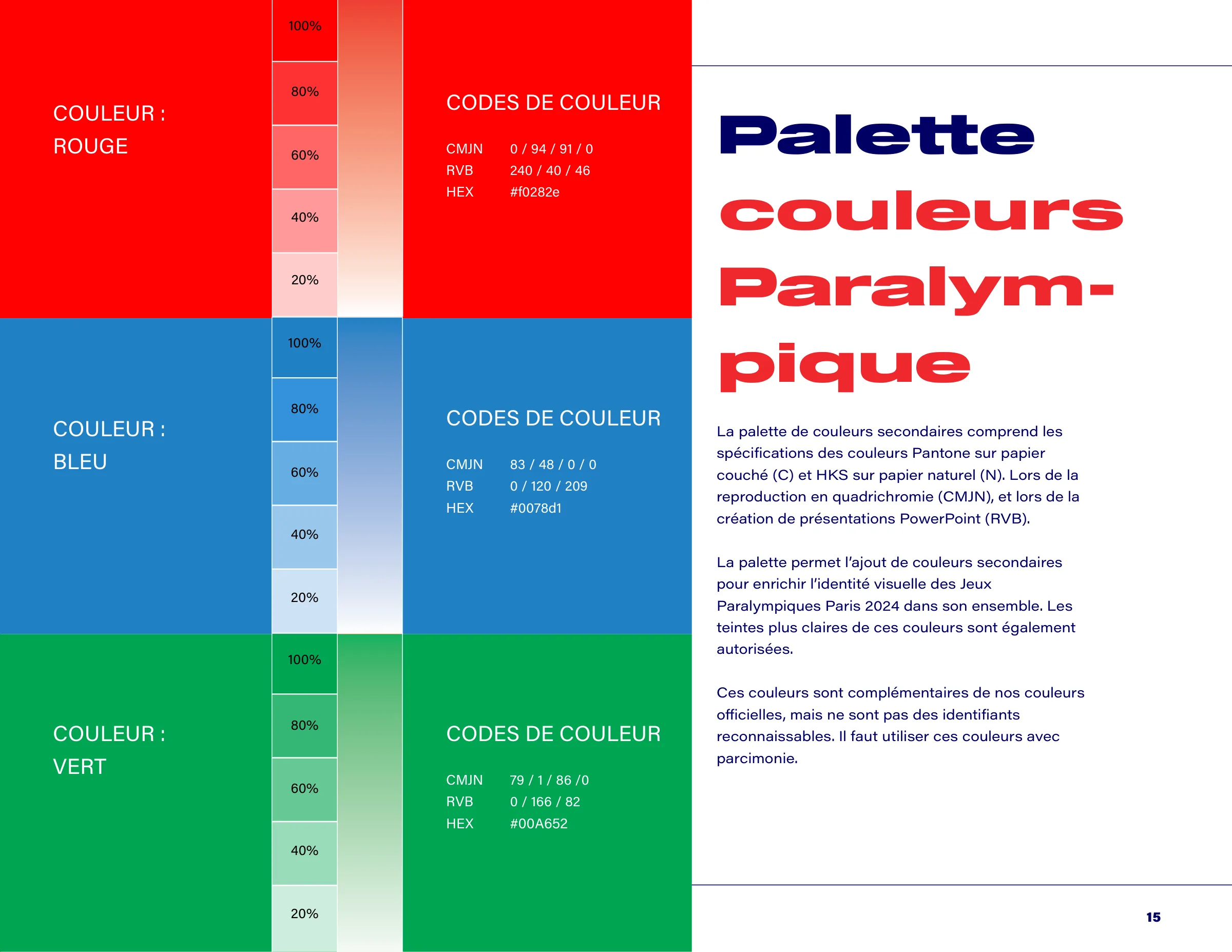
Three primary colours carry the Games identity: a very dark blue #000065, a pink #E7C7CA and a red #ED1C24, used at 100% for the logo and backgrounds. Three Paralympic colours complete them, to be used sparingly: a red #F0282E, a blue #0078D1 and a green #00A652. Each colour comes in CMYK, RGB and hex, with its 80 to 20% tints.
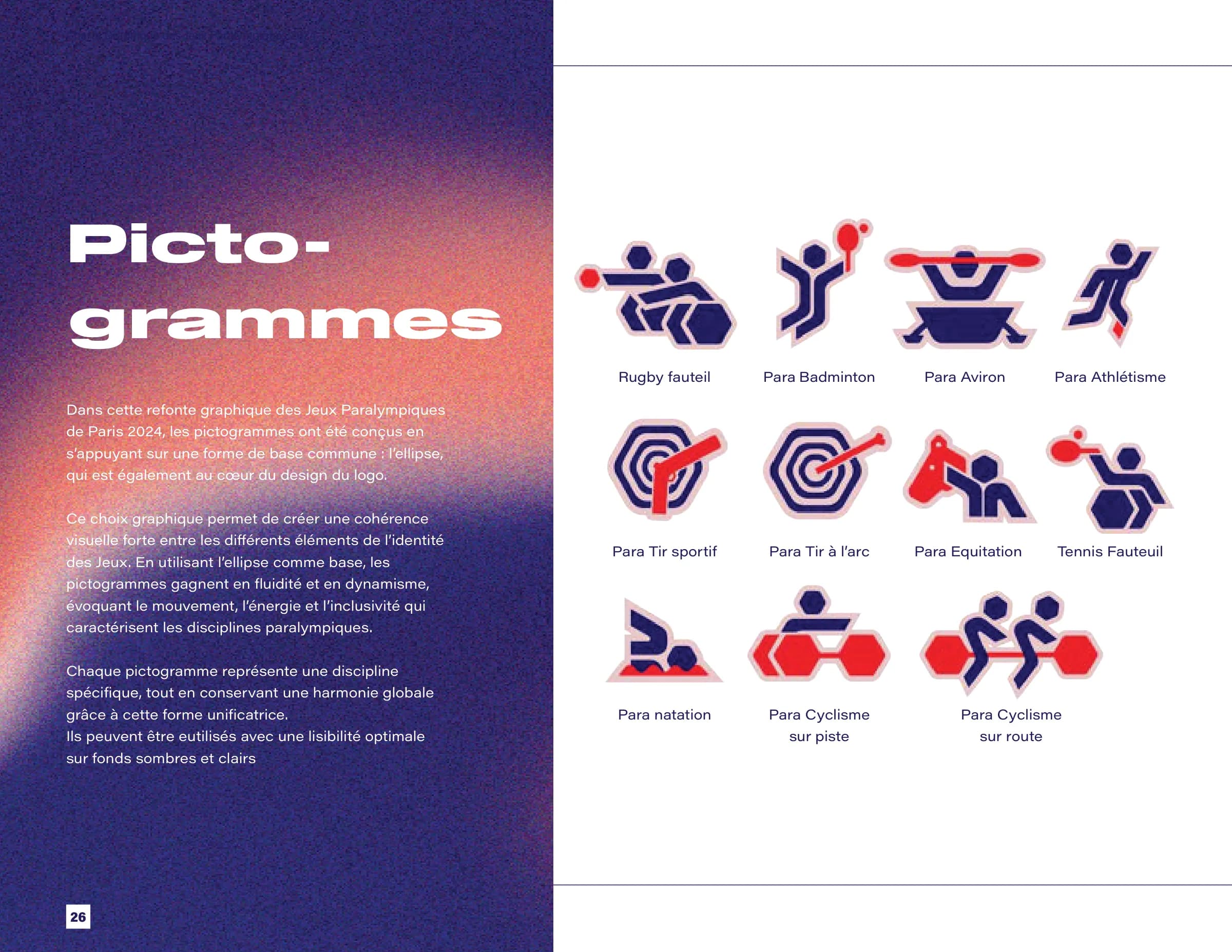
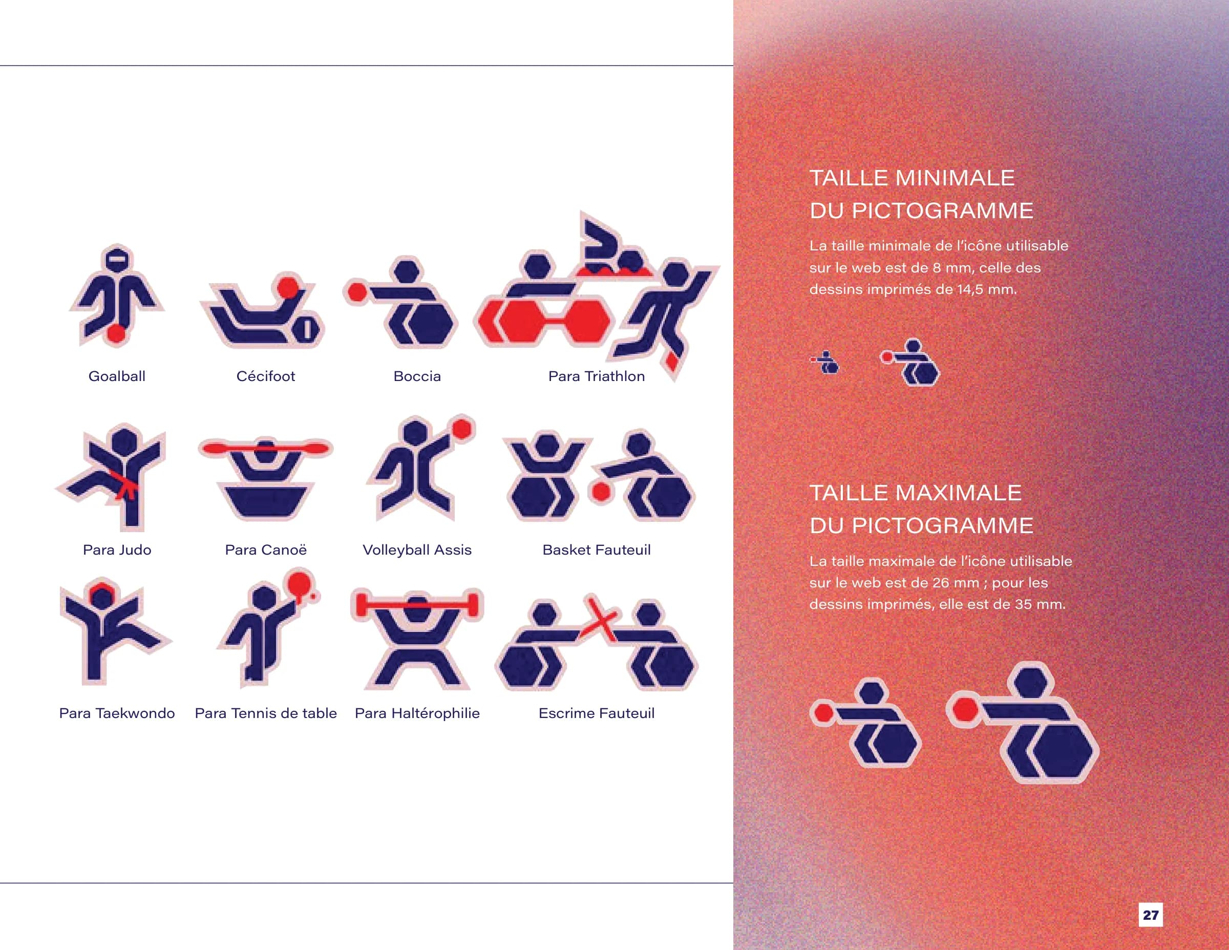
23 pictograms
The pictograms all start from a single shape, the ellipse, already at the heart of the logo. It ties each discipline to the rest of the identity and gives the figures their flow: wheelchair rugby, para swimming, blind football, boccia, wheelchair fencing… Legible on light and dark backgrounds, with minimum and maximum sizes set for web and print.
The mockups
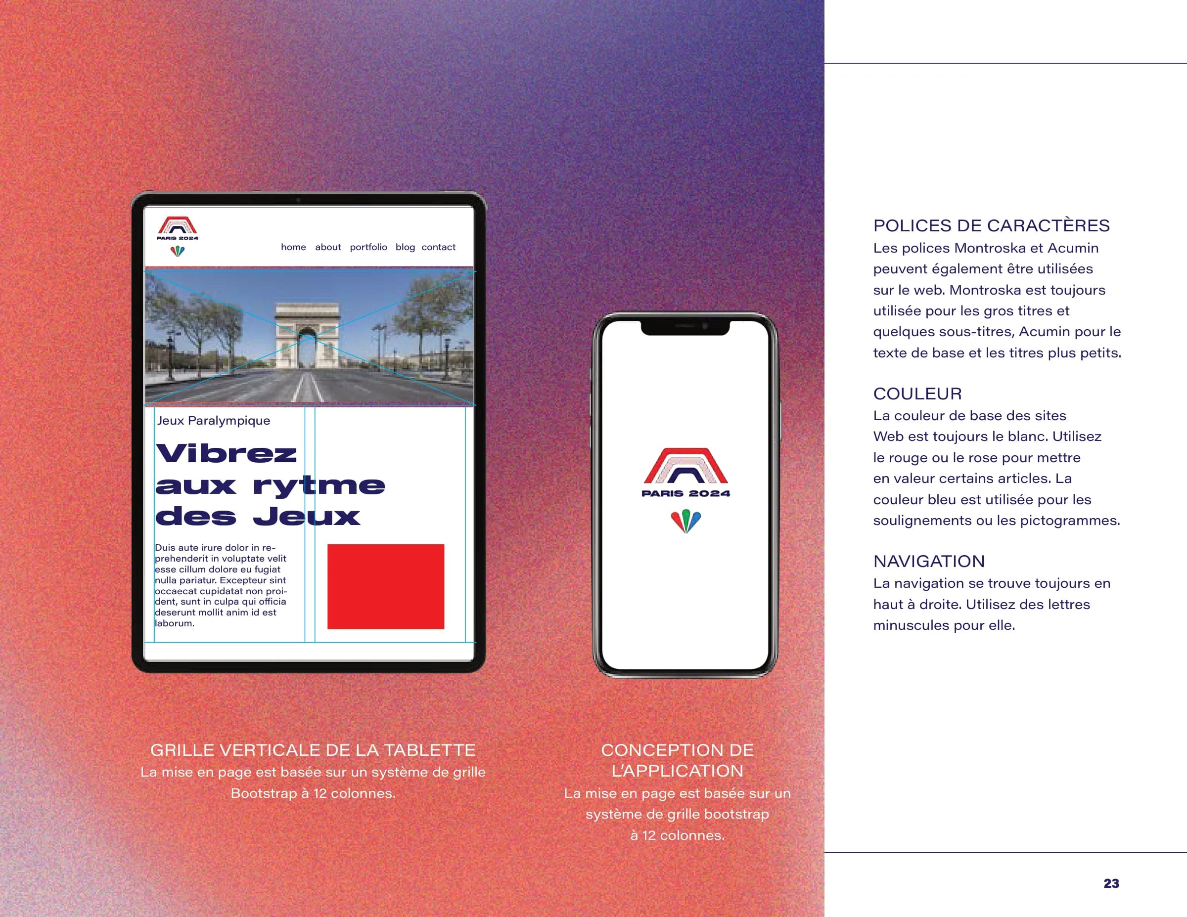
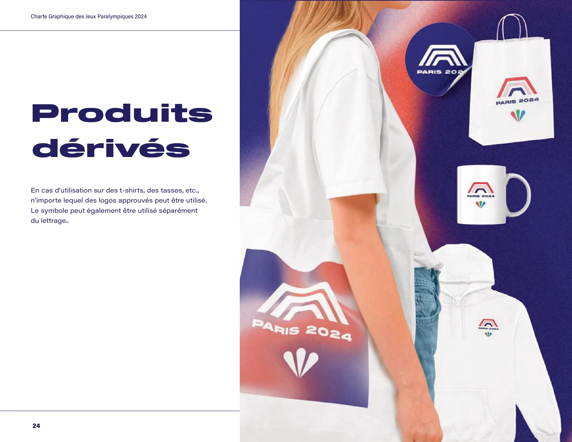
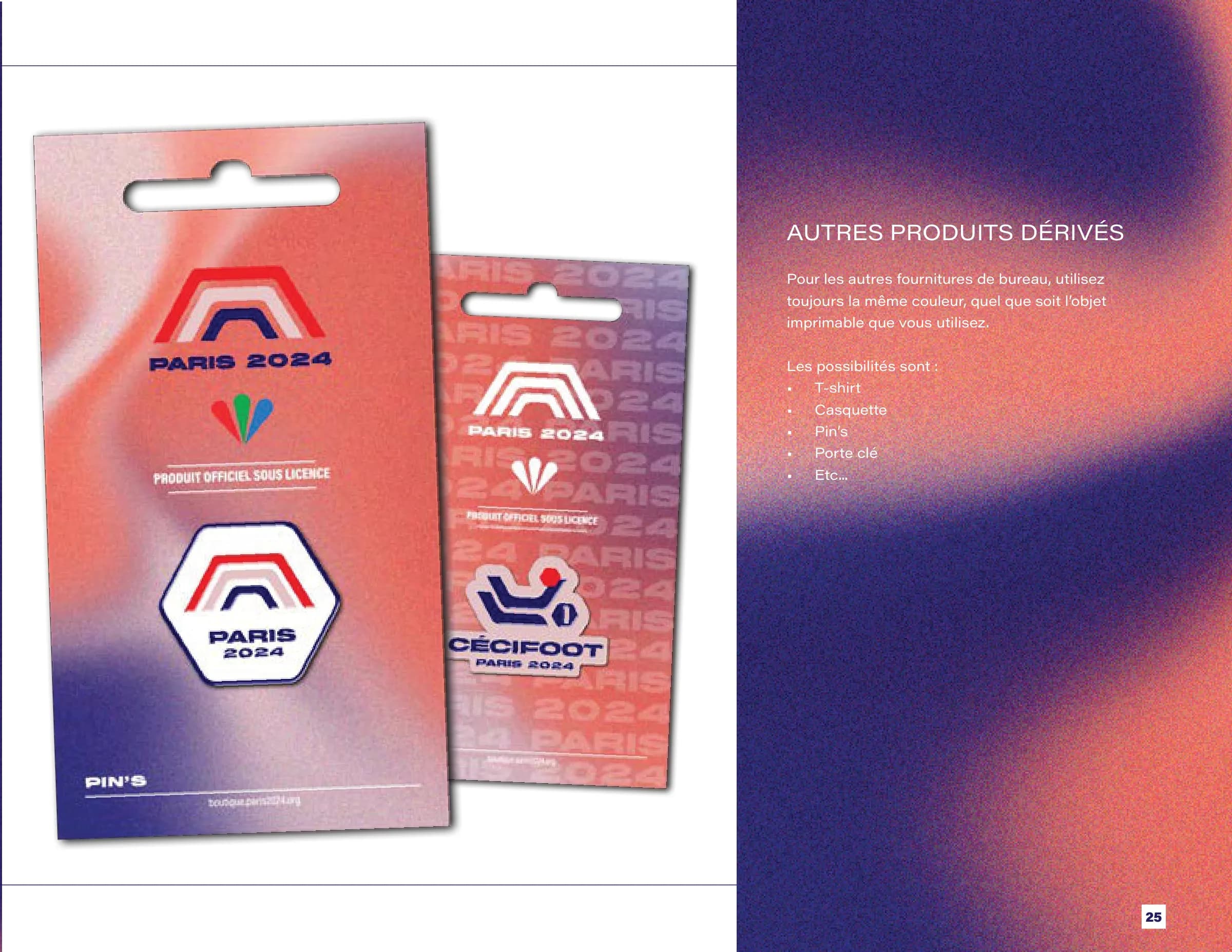
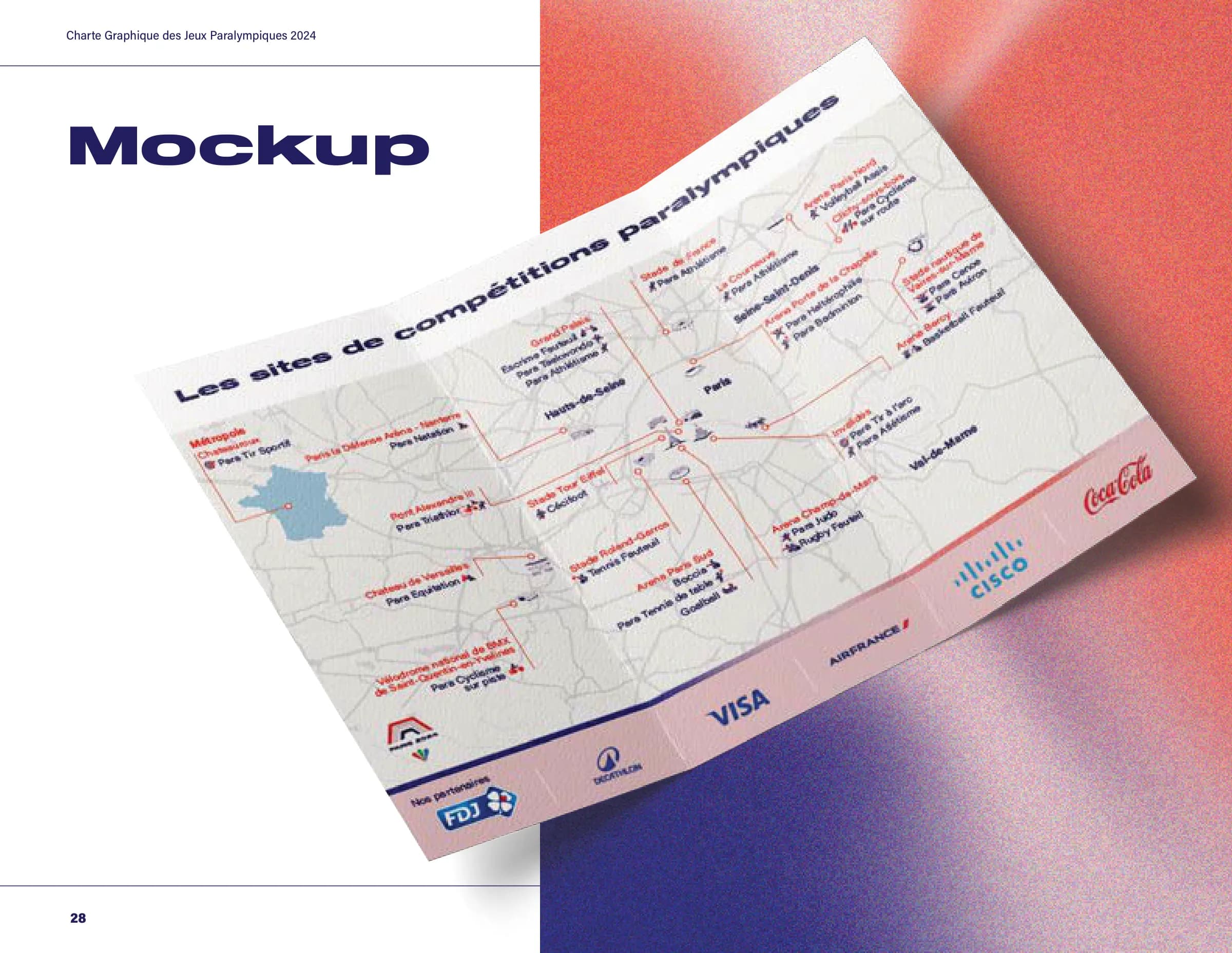
My most visible part: showing the identity in context. A website on a 12-column grid, adapted for desktop, tablet and app; merchandise (tote bag, paper bag, mug, hoodie, sticker, pins); and a leaflet of the competition venues, with the map and pictograms. Each item applies the guidelines: white background, red or pink for emphasis, blue for underlines and pictograms.
Tools
Figma · Illustrator · Photoshop · InDesign
Documents
Credits
- Role
- Art direction vision and thinking, mockup design
- Timeline
- 2 weeks
Team
- Alice Da CostaTechnical art direction: logo, colours, applicationsLinkedIn