Journal
Building the visual identity
How blending Swiss design rigor, tactile Liquid Glass and automated contrast test scripts shaped the portfolio's visual identity.
When designing your own portfolio, the greatest pitfall is throwing in too many unrelated ideas. For this release, I took the opposite path: anchoring a radical visual identity into a strict layout grid while infusing tactile, contemporary textures.
1. Awwwards scouting and the love of Swiss design
Before laying down the first pixels, I spent extensive time dissecting top productions on Awwwards to understand what makes memorable sites stand out. The answer was never flashy, gratuitous animation, but typographic weight and structural clarity.
I have always been drawn to the International Typographic Style (Swiss design): an uncompromising grid, generous breathing room, and bold weight contrasts. That foundation led to our core typographic pairing: Archivo (in its extreme Thin and Fat cuts) for expressive display headers, and Hanken Grotesk for effortless body copy legibility.
2. Introducing Liquid Glass
Stopping at a bare Swiss grid would have felt overly restrained. I wanted the interface to carry tangible weight under cursor and finger. That sparked the Liquid Glass concept: combining the geometric discipline of the grid with the organic refraction of glass.
It is a direct nod to emerging spatial and tactile UI paradigms (akin to visionOS or hints of iOS 26): translucent volumes, beveled highlights catching ambient light, and fluted glass softly warping the background.
3. Dual Dark & Light themes pushed to 100%
Dark and light modes are often treated as an afterthought: swap black and white, call it done. Here, each mode was built around its own distinct chromatic identity:
In light mode, sterile white was set aside for an electric signature cobalt blue (#0029FF). Saturated and punchy, it lends dramatic depth to glass refractions. In dark mode, the tone shifts into a deep warm mineral black (#08090D), intimate and calm without flattening into dull gray.
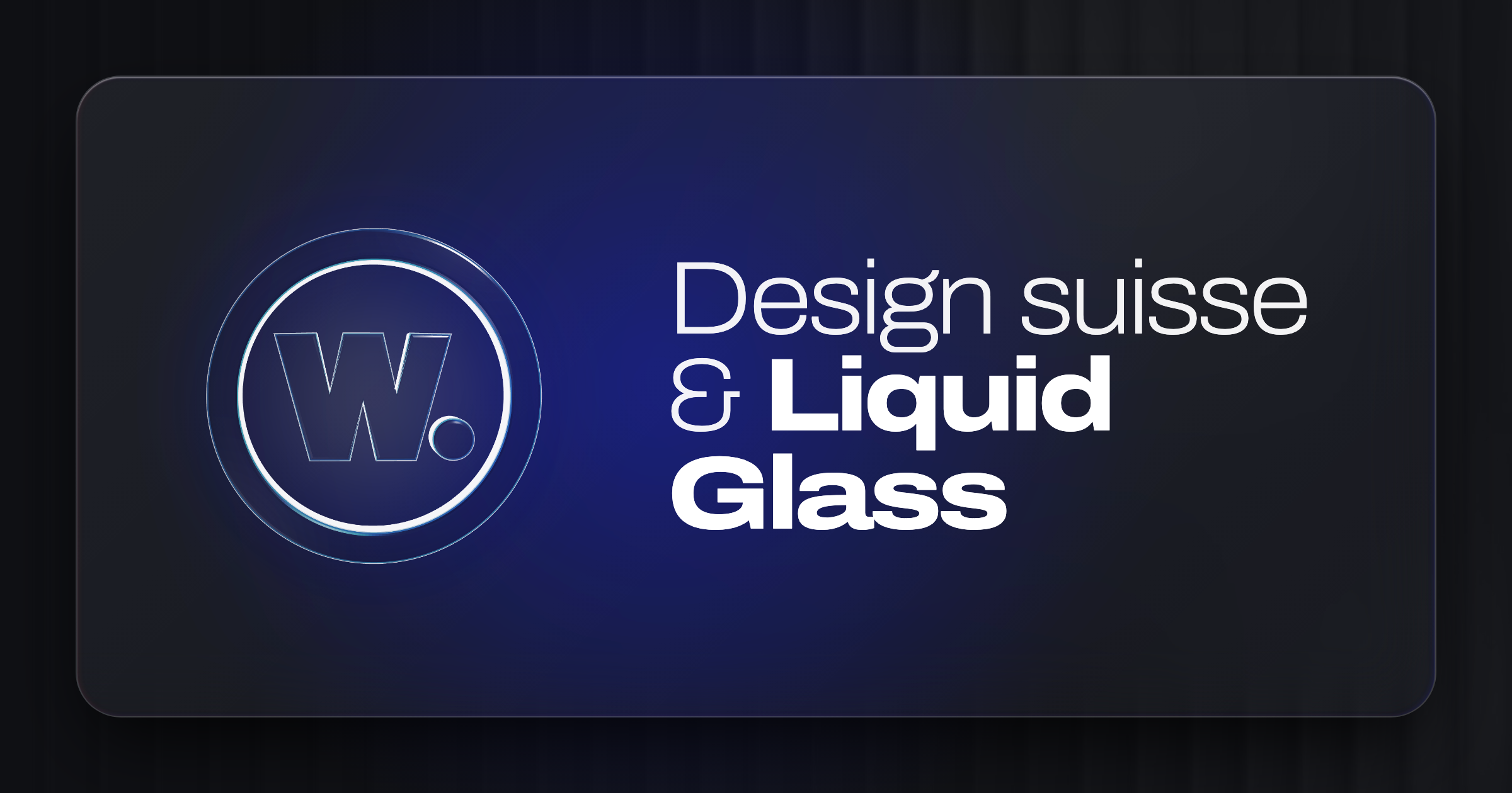
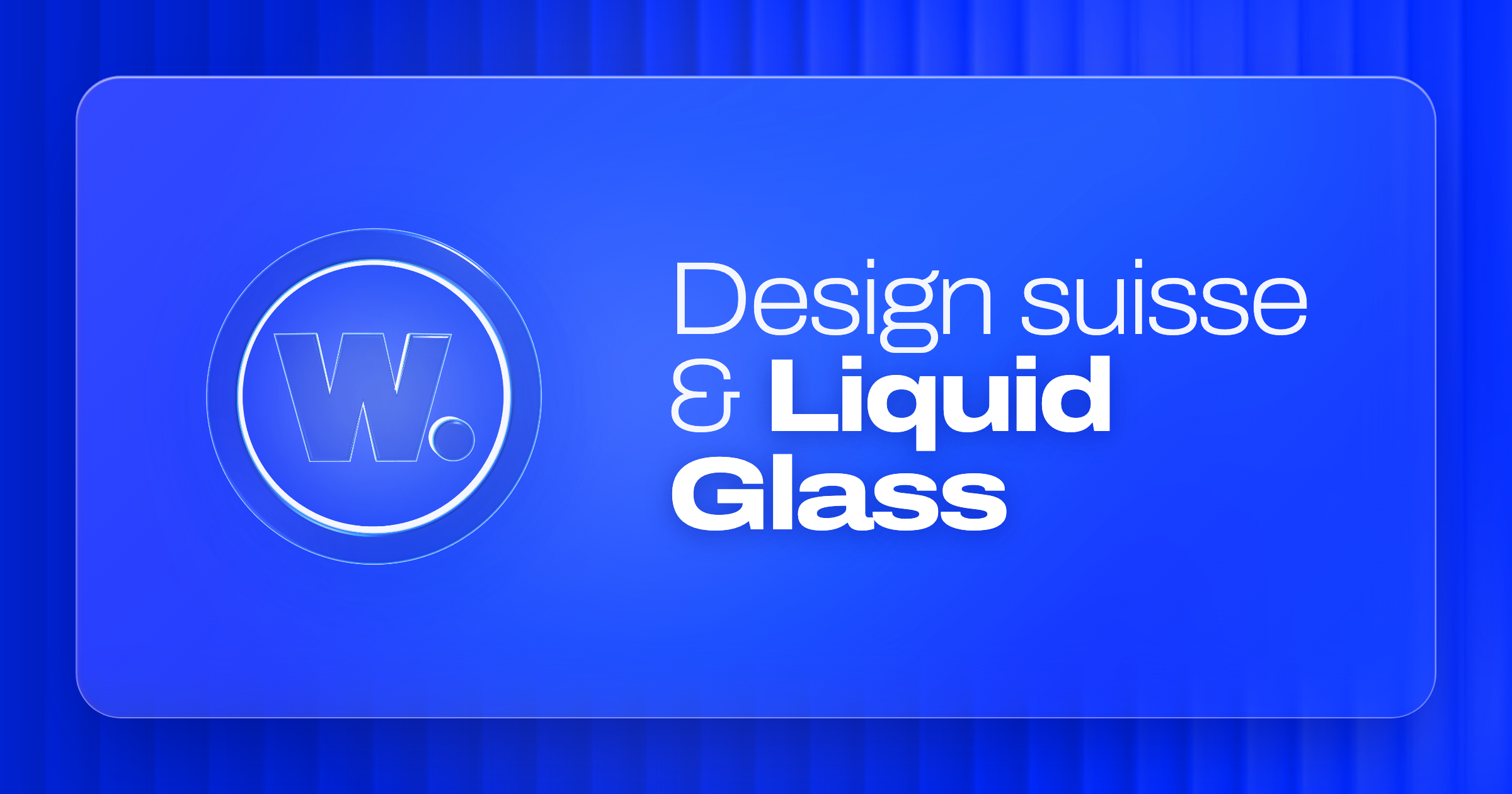
Crucially, absolutely EVERYTHING on the site adapts to the active theme without exception. Even the article thumbnails in this journal switch dynamically: every post features custom-rendered cobalt and dark covers. When you toggle the theme switch, the card artwork shifts seamlessly right before your eyes. That level of attention to detail is what elevates a portfolio into a polished, professional piece of craftsmanship.
4. Contrast engineering: script-driven validation
The technical challenge came with translucent glass layers, blurred backdrops, and saturated color fields: accessibility and contrast ratio compliance cannot be left to guesswork.
Rather than eyeballing each component, I wrote automated contrast checking scripts evaluating sections against WCAG and APCA standards. Every text-to-background pairing, beveled stroke, and transparency level was programmatically tested.
These scripts guided precise opacity tuning: brightening display typography on cobalt, calibrating box shadows for floating pills, and injecting gentle rim lighting in dark mode so glass forms stay tangible in low light.
Performance-wise, theme transitions remain zero-flicker (no FOUC) and zero-overhead: pure CSS variables and deterministic classes handle the styling, maintaining a solid 60 FPS.
5. Key takeaways
Shaping this visual identity reaffirmed a core belief: interface craft is never solely about aesthetics nor solely about engineering. The continuous dialogue between visual ambition, layout rigor, and automated code validation is what makes an experience memorable.